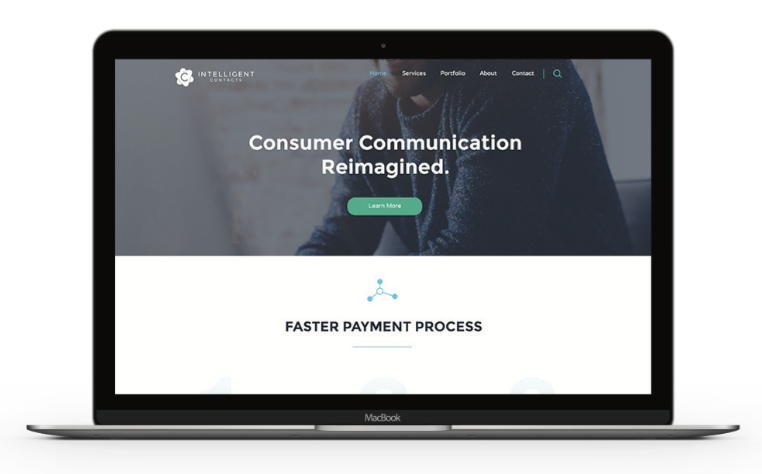
INTELLIGENT CONTACTS | PLANO, TX

FEATURED SERVICES:
• Brand Brief
• Logo Design
• Social Media Graphics
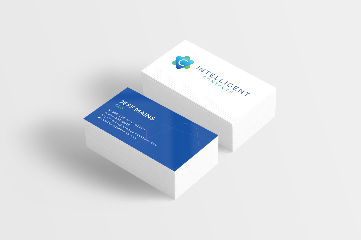
• Business Cards
INTELLIGENT CONTACTS IS AN UP AND COMING COMMUNICATIONS GIANT.

Intelligent Contacts was founded five years ago and hit its stride serving contact centers in the
Right from the start, we knew telling the brand’s story would be tricky. When we received the target brand personas back from the client, we noticed there were 3 main personas that were strikingly different. The big question became, how could we create a brand that would resonate with the needs and desires of all 3 at the same time? We also needed to create a brand that stood out from the competition and came from a platform that made sense for selling IC’s products and services.

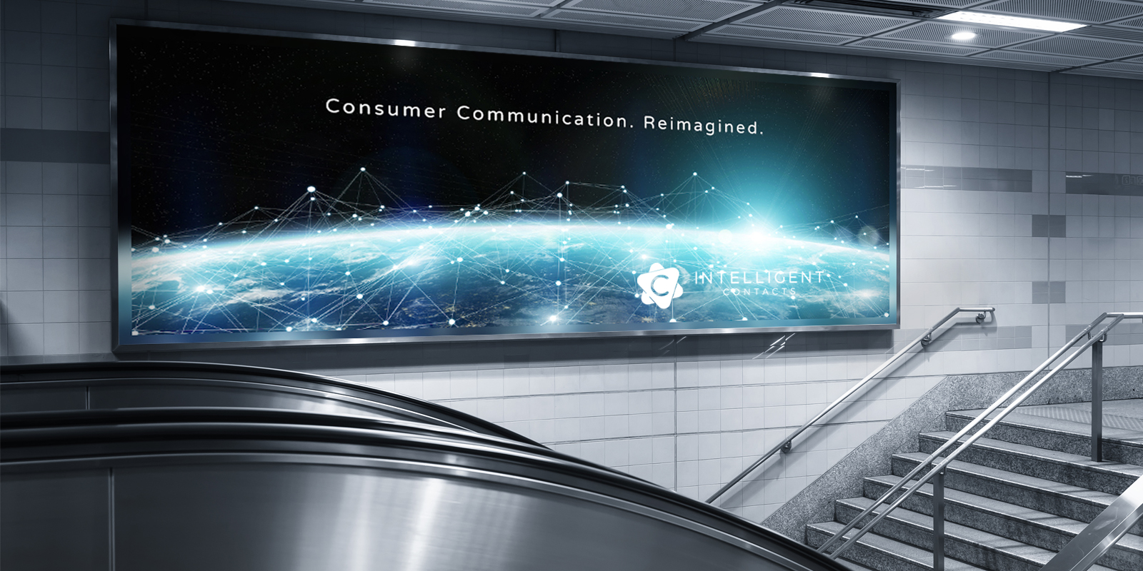
Intelligent Contacts’ brand imagery conveys the message of harnessing technology to make business systems simpler, connected and within reach. The photography takes on a magical quality as it visualizes the unseen and mysterious network of technological advances. Also, unlike competitors, it positions you in the marketplace as a technological leader and focuses on improving the experience of the client rather than solely the experience of the end user.

STRATEGY
We tried on a few brand archetypes for IC, until we found a good fit with Magician. Telling the brand’s story from the perspective of the Magician, allowed us to appeal to all of the target brand personas and became an excellent way to sell the “magic” of their cutting-edge technologies, tiny turnaround time and amazing customization. It was also very different from how any of the competition was approaching their brand strategy.

SOLUTION
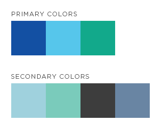
The final brand identity freshens the tired and dingy color scheme as well as modernizes the typeface, creating the modern, crisp look we were after. The logo shapes and gradients suggest atomic movement and bring to mind both science and the magic of technology. Photography for the brand is crisp and clean with rich, cool hues. The brand’s graphic elements and overlays are really what tells the story, though. Connecting lines, geometric shapes and techy patterns, leave the customer feeling like Intelligent Contacts is the brand of choice.
