LIMBER PINES WELLNESS CENTER | VERNAL, UT

FEATURED SERVICES:
• Revitalized Brand Brief
• New Logo Architecture
• Social Media Graphics
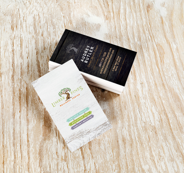
• Business Cards
OVERVIEW
LIMBER PINES HAD A FRESH IDEA FOR A TOWN WITH LIMITED CHOICES
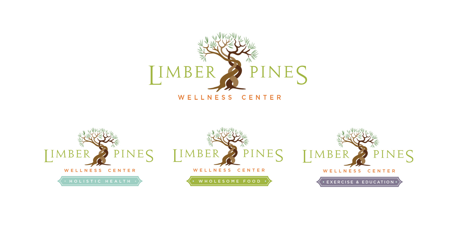
The Limber Pines name was inspired by a tree that grows in Utah. A certain bird buries caches of the tree’s seeds in the ground for the winter, and every now and then forgets about one. When the seeds sprout so close together, the trees twist around each other and merge together as they grow. The founders of Limber Pines thought this tree represented what they were trying to create with their business. Springing forth from one little town, they wanted to bring together the farmers, the alternative healers and the people looking for these products and services. Together, they could build a thriving community-driven business and bring better health to everyone.
OUR PURPOSE
To create a vibrant and thriving community of local farmers, holistic care providers and healthy people.
BACKGROUND
Limber Pines has a new idea of doing business. In an out of the way town in Utah, they are creating a place where people can have options when it comes to their health and the food they eat. Limber Pines is a combination farmer’s market co-op, a wellness center, where alternative therapists and healers can hold appointments with their clients, and an exercise and education center. This way, they can make it easier for alternative health practitioners to stay in business and attract more clients as well as bring more affordable, local, organic food and product choices to a small town by connecting nearby farmers and other producers with a place to sell their goods.
CHALLENGE
Since the Limber Pines business model is unique, one of the challenges with developing the brand was figuring out a way to let people know what the company did, and all the aspects associated with it. The other challenge was getting potential customers to change their habits and begin shopping at the market and coming to the center for healthcare and educational classes.


STRATEGY
Our strategy consisted of developing a brand architecture that unified the brand, but also distinctly represented each aspect of the business. Limber Pines Wellness Center became the master brand with 3 sub-brands called Holistic Health, Wholesome Food and Exercise and Education. Clearly recognizable as the same brand because of the logo structure, the architecture also quickly communicated all the aspects of the company.
The brand also needed to be designed to attract the people that hate shopping at grocery stores and are already hungry for the products and services that Limber Pines offers. Attracting the right market quickly will enable the business to stay afloat until it can get the word out to less eager potential customers and a thriving community is built.


SOLUTION
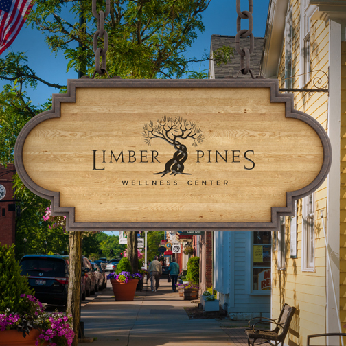
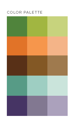
So, using a rustic, yet Asian-inspired styling, we created a zen-like brand experience that makes customers feel good about feeding their families healthy, local food. The final logo, hand illustrated, and painstakingly perfected, accomplishes all of our objectives and creates the promise of the ideal health experience. A color system was developed as well for each of the sub-brands so they all harmonize and complement each other.