ISE TRAINING | DRAPER, UT
“I want to take a moment to honor Right Think. What an amazing company. Their team is made up of the most high-classed and skilled individuals I have ever worked with.
Talk about nailing it. They really helped me find clarity and build power in my message and brand. The process and delivery were very professional and smooth. If anyone needs next level branding I highly recommend reaching out to them.”
— Steve McCleery, Founder & CEO, ISE Training
FEATURED SERVICES:
• Brand Brief
• New Logo & Identity
• Social Media Graphics
• Business Cards
OVERVIEW
ISE TRAINING WAS A START-UP THAT NEEDED A BIG BRAND FEEL.
An ambitious company, ISE is tackling the gambit of self- development training including physical, nutritional, mental, emotional, relationship, business, money and self-mastery coaching. Their company includes expert coaches that specialize in each
Their main goal is to empower people with solutions and techniques that unleash human potential and get themselves in alignment with their purpose.

BACKGROUND
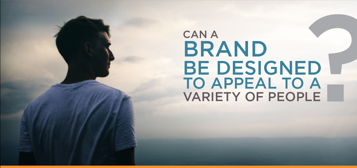
We knew that the ISE brand was going to demand a lot. It had to be scalable so that it had room to grow as the company grew and expanded its product line as well as appeal to a wide variety of target avatars
CHALLENGE
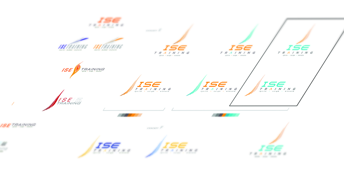
With such a wide range of services and avatars, we decided to create a logo that called to the commonalities in us all, rather than one that differentiated people. Whatever a person’s phase of life or background, most of us are rooted in the common desire of increasing amounts of hope, light, truth, strength, inspiration, abundance, success, liberation and empowerment in our lives. With these universal attributes, we could build an inclusive brand with a large enough values foundation that anyone could stand on it.
STRATEGY
When people encountered the ISE brand, we wanted them to feel ignited and empowered, the feeling you get when you hear something true and it resonates with your core. People also needed to quickly understand the benefits that ISE Training can offer them, like increased health, a stronger body, greater endurance, self-mastery and control,
ISE Training needed to stand out from some well-established competitors, so they needed some help figuring out how to differentiate their brand. ISE had determined, that their main sales funnel would begin at gyms, offered as an up-sell to people who were there trying to improve their bodies and wanted additional coaching. Because of this, the concepts we developed for them were inspired by athleticism, discipline and the human quest for perfection.
SOLUTION
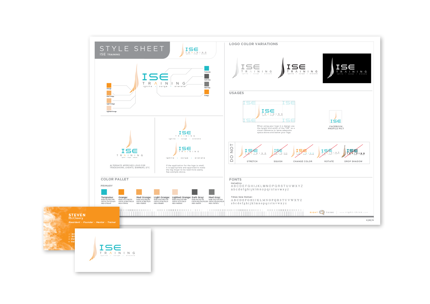
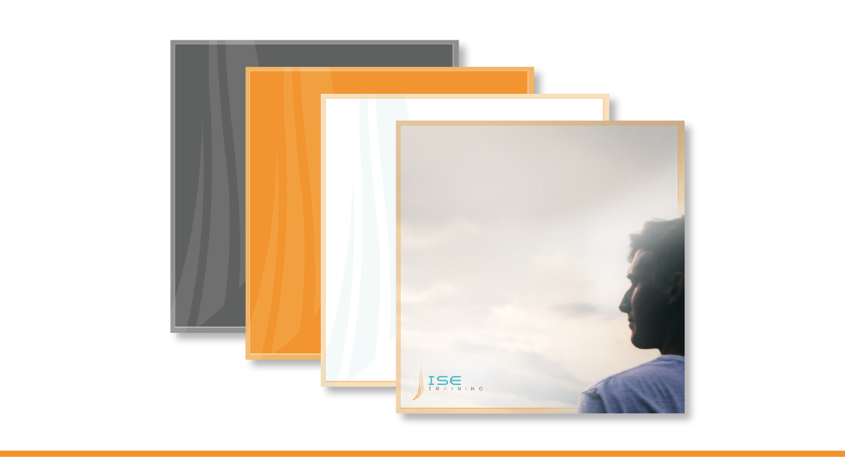
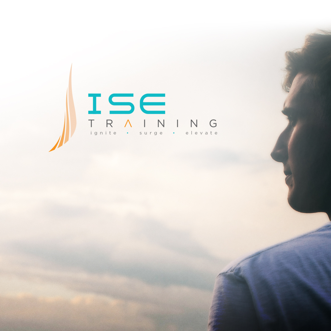
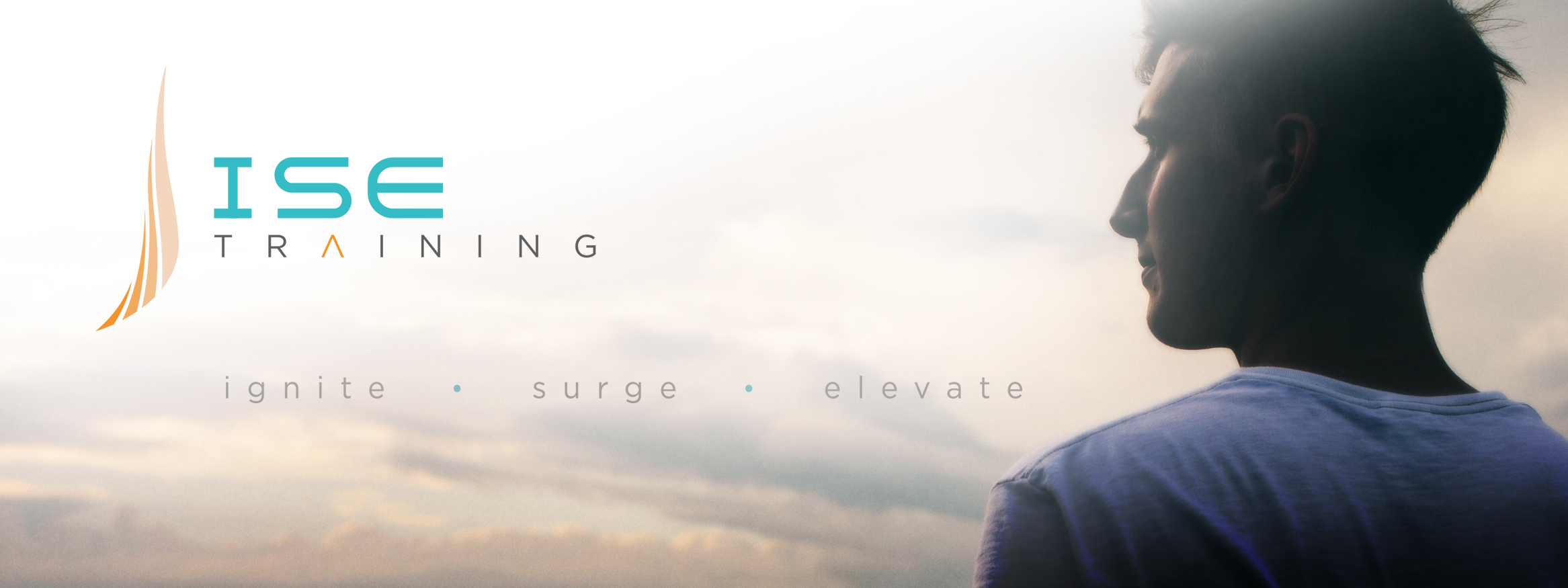
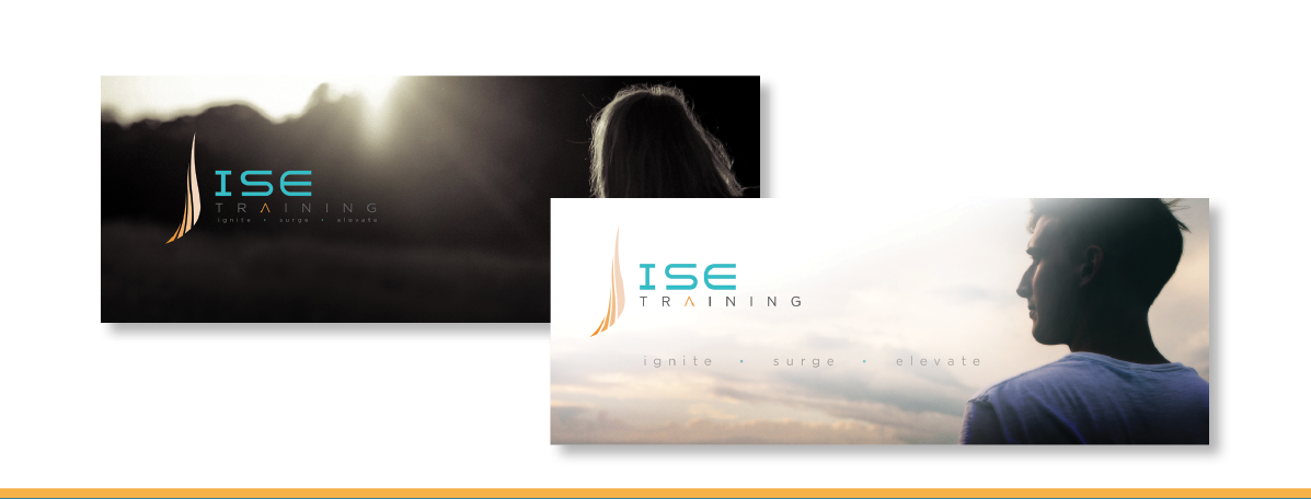
The final logo became a blend of 2 concepts, combining the modern and techy font embodied in concept A, with the fluid, uplifting flame from concept D, a wonderful juxtaposition of spirit and structure. The color palette was also carefully thought through with the flame becoming a progression of shades from dark to lightest orange, symbolizing the self-improvement journey to greater levels of self-understanding and enlightenment. The teal blue paired with the structured and con dent font, also suggests calm, patience and trust.
Photography is an important part of the ISE brand, with big images that subtly convey the quiet strength and power of the human spirit when the body has been mastered. The photos imply a promise of vision, direction, and control, invoking those emotions in the viewer.