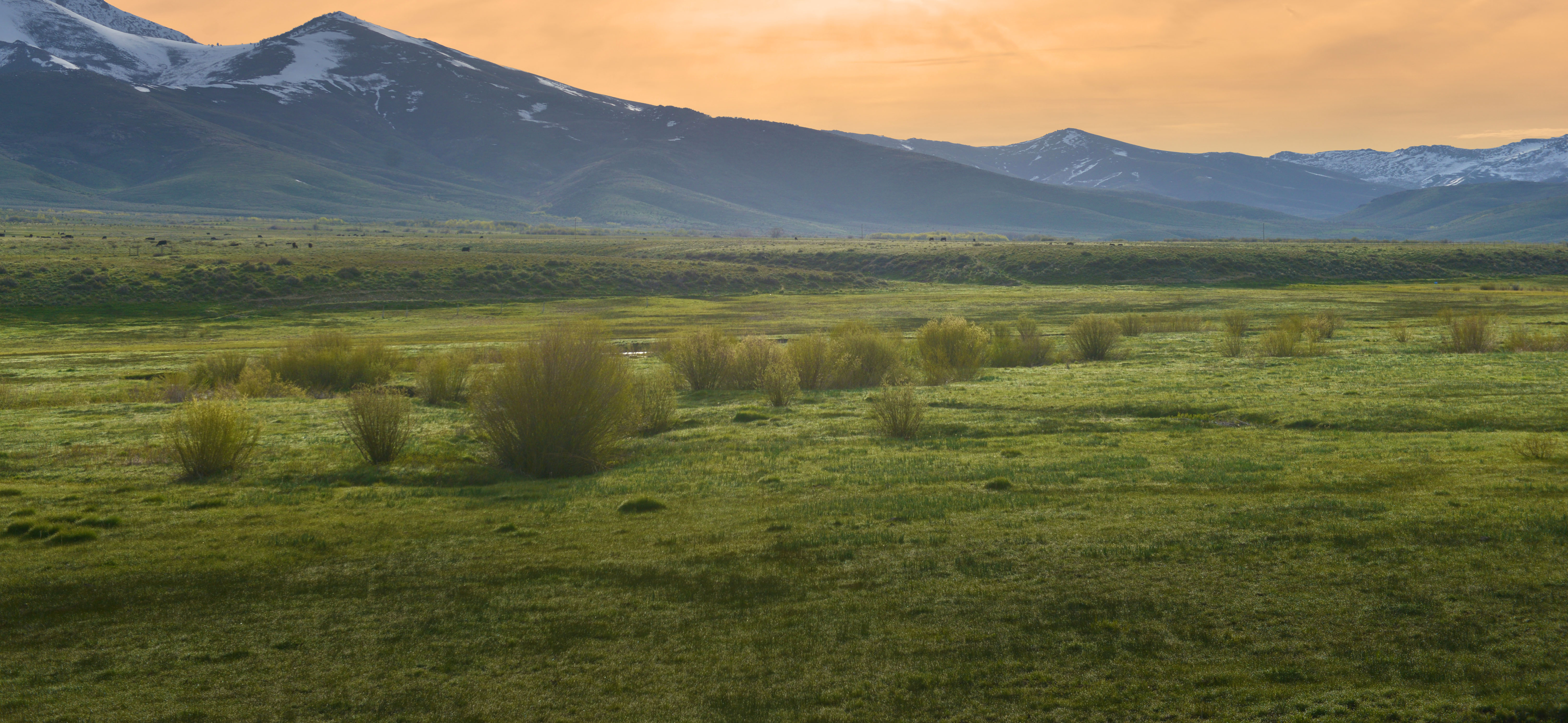
Ruby Mountain, Nevada
“The entire team at Right Think were extremely responsive and helpful. But what I really appreciated was their innovation in designs. They really understood my brand and were able to create a beautiful visual representation of who we are.”
— Selena Sorensen, Owner
FEATURED SERVICES:
• Revitalized Brand Brief
• New Logo Architecture
• Social Media Graphics
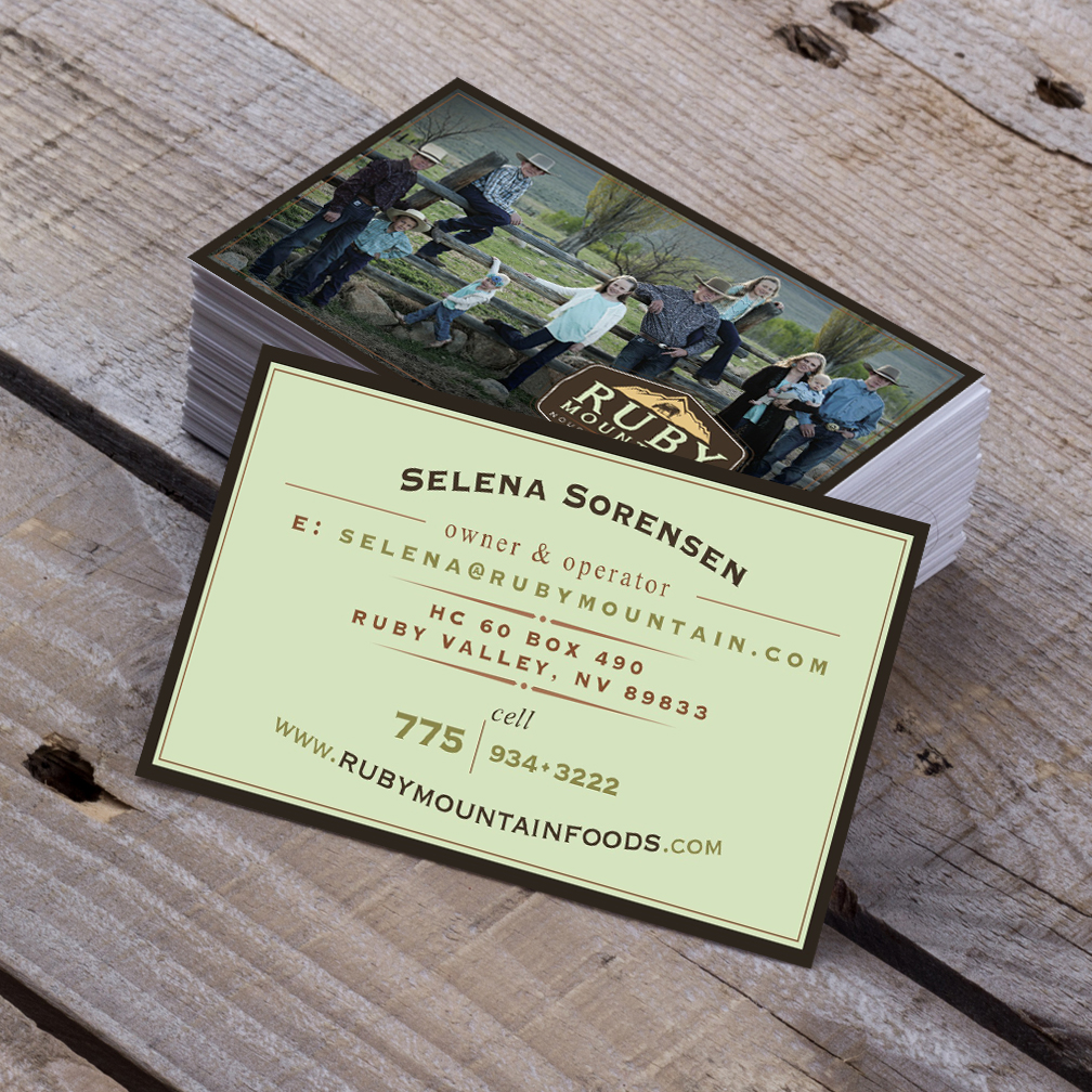
• Business Cards
• Website
• Signage
OVERVIEW
RUBY MOUNTAIN NOURISHING FOODS NEEDED TO TRANSFORM THEIR BRAND TO COMMUNICATE WHO THEY REALLY ARE.
BACKGROUND
Up until 2015, Ruby Mountain’s success depended largely on local restaurants and long-existing accounts. Future plans for the company included adding a new service that would ship farm-fresh beef to households all over the country. Marketing for this new service would take place mostly on social media channels. The company realized that in order to expand into a new market demographic, that they would need to take a look at their brand and make sure it was working hard to communicate their messaging. What we found wasn’t good.
CHALLENGE
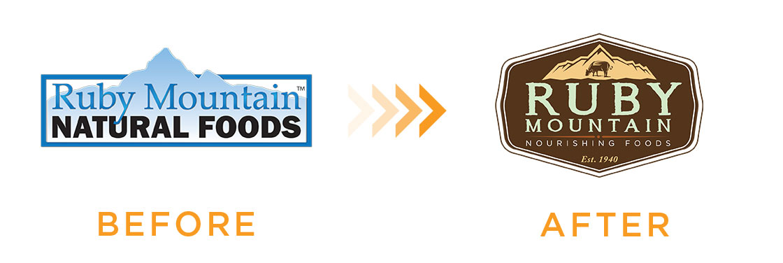
In addition to being incredibly outdated, Ruby Mountain’s old logo said nothing about who they are. You can see below that the old logo was sterile and stark. Even though it says the words “natural foods,” the visual feeling you get from the art is unfriendly and cold. It resembles something you might see on a frozen food company carton delivered to the loading dock of a restaurant, but it definitely does not promising a customer-facing, fresh, all-natural, family-oriented experience. It missed the mark completely.
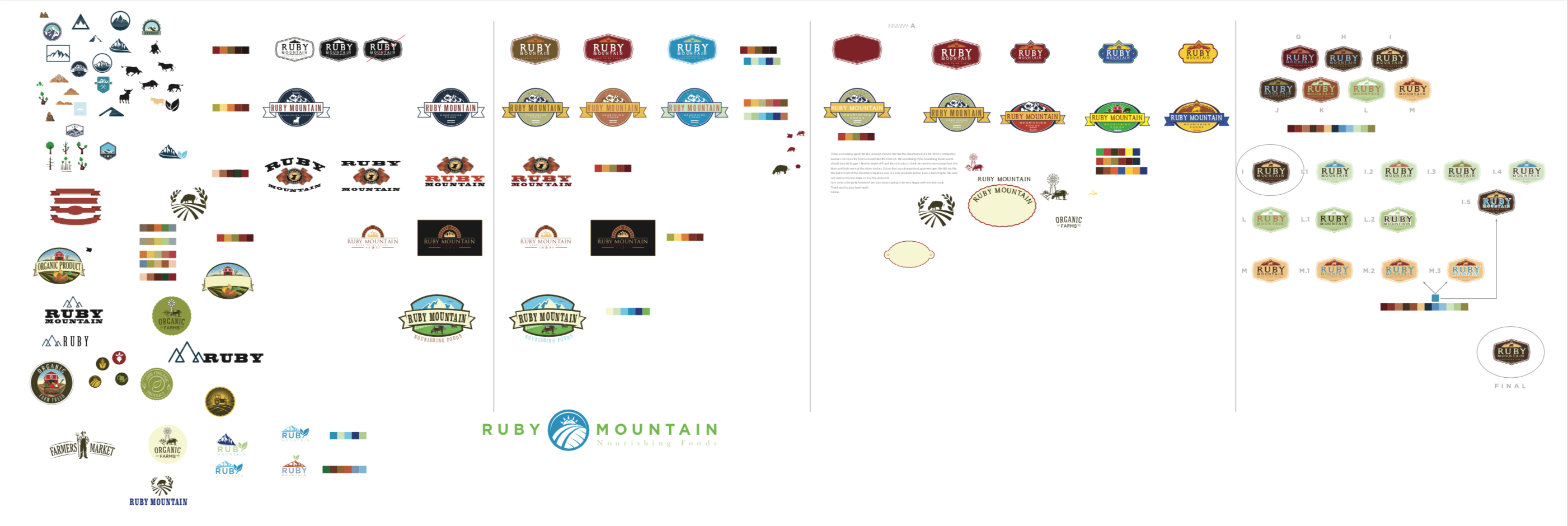
LOGO TRANSFORMATION
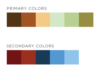
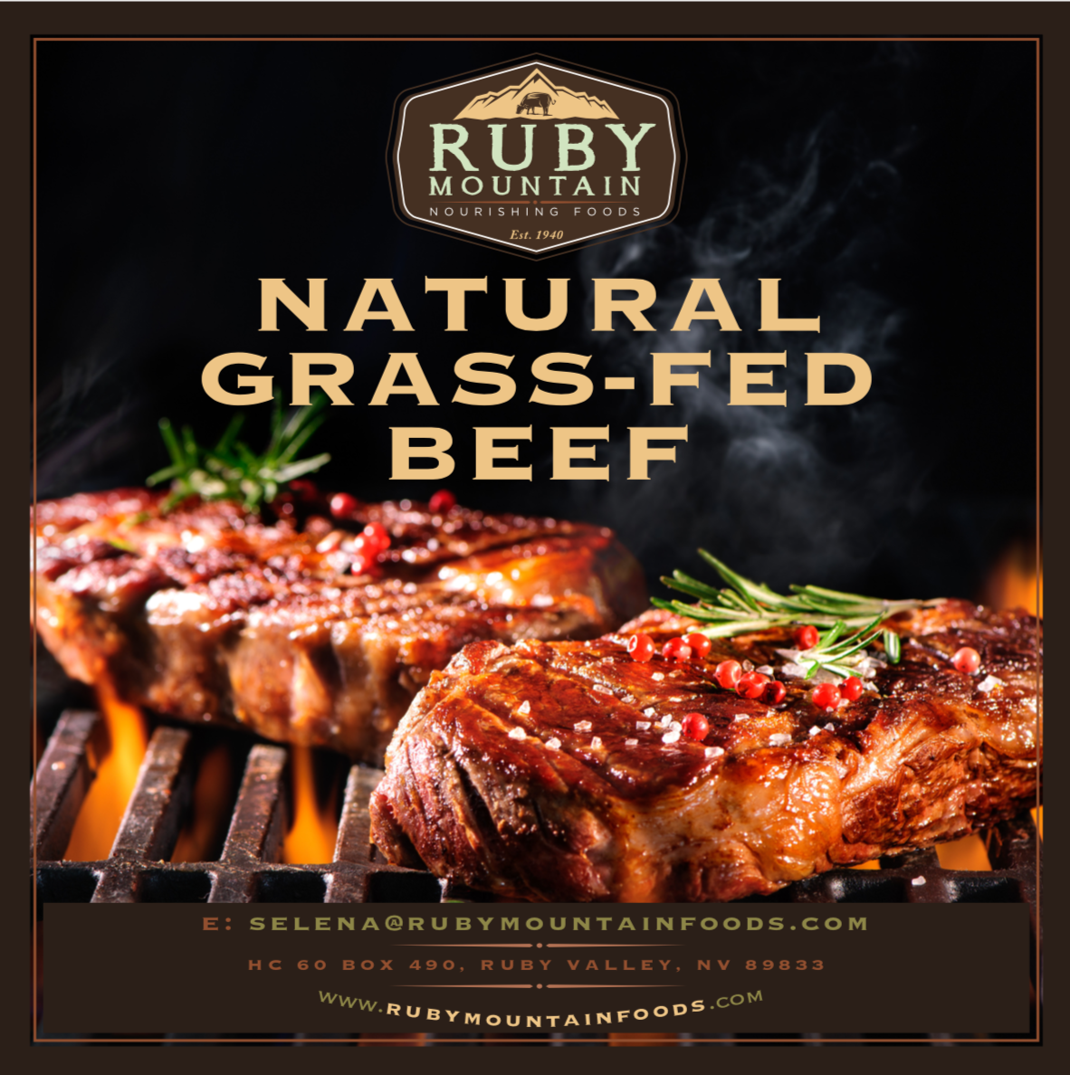
We created Ruby Mountain’s new logo with their messaging in mind. The rich brown and green color scheme represents the natural processes and products that Ruby Mountain utilizes and provides. The badge style of the logo suggests tradition and a seal of quality. The typography is trustworthy with a touch of the rugged outdoors. And, the cow grazing immediately communicates to the customer that this is a grass-fed beef company.
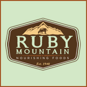
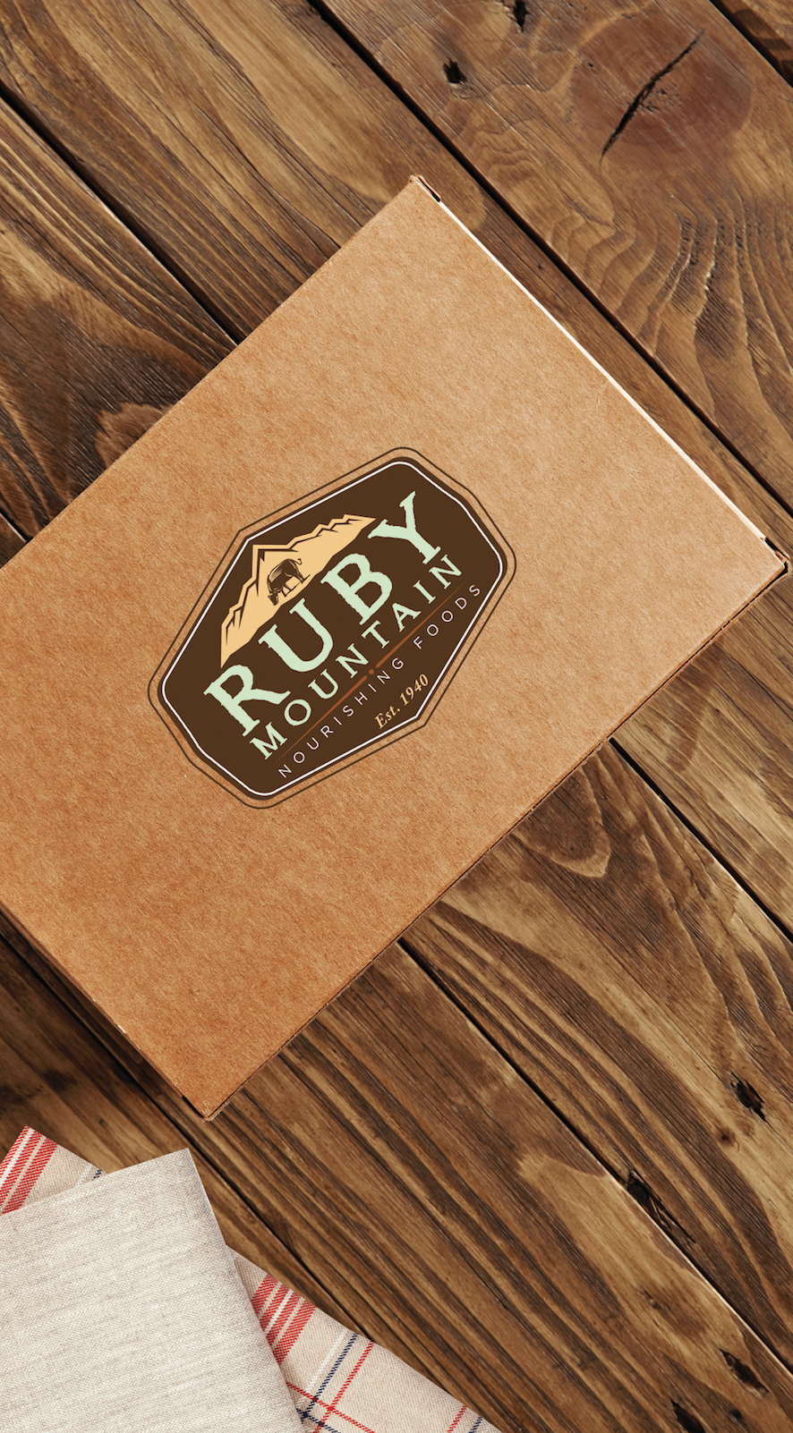
BRAND EXPRESSION
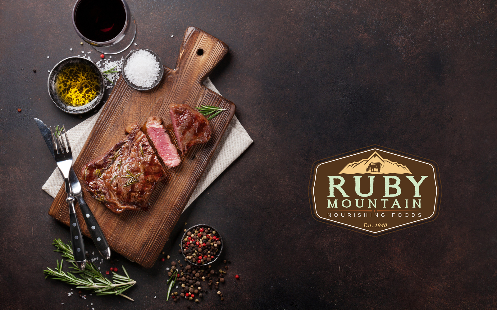
After the final logo was approved, we began working on the other marketing materials the brand needed to stay consistent with its messaging. It is vital that the customer understands who Ruby Mountain is, as well as the value that they offer. Since buying meat from Ruby Mountain costs more than the meat at the grocery store, the look of the brand needs to command a premium and live up to its promise.

SOLUTION
The new Ruby Mountain brand works to convey the brand message of nutritious, all-natural grass-fed beef to a target market that values giving their family the best quality food. Compared to other well-established brands in the same niche, Ruby Mountain holds its own. Good design and consistency give the brand legitimacy that builds trust and customer loyalty.